PKF Francis Clark
Belong. Be Brilliant. Be You.
Employer Brand and interim Visual Identity
PKF Francis Clark is the largest independent chartered accountancy firm in the South West, and a key member of the global PKF International network.
While preparing for a major group-wide rebrand, PKF Francis Clark recognised the need for a cohesive, compelling interim employer brand to attract and retain talent across the region.
They’d invested in extensive research to better understand employee experience and expectations with findings clearly pointing to a strong culture of belonging, empowerment, and authenticity—elements that needed to be made visible and vibrant across internal and recruitment communications.


Insight showed that a balance between professional ambition and a genuinely supportive culture was needed, a brand platform to blend emotional resonance with rational clarity.
“Belong. Be Brilliant. Be You.” emerged as a unifying expression of what makes a career at PKF unique: a sense of real belonging, meaningful career growth and the freedom to be your authentic self within a collaborative team.
PKFFC’s new Employer Brand Statement captures the best of both worlds – big-firm opportunity with small-firm heart. Perfect!
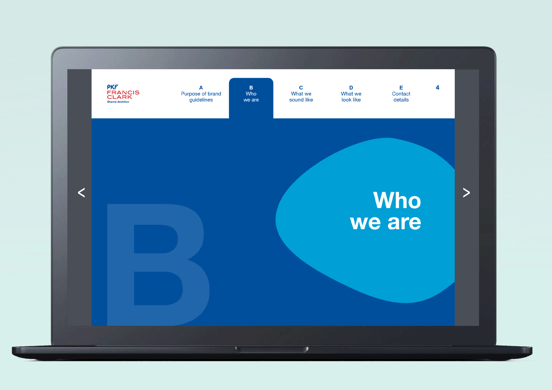
To bridge the gap between their existing identity and the upcoming PKF International rebrand, we needed to develop an interim visual identity that was:
Aligned with their internal values
Aligned to the existing brand
Authentic to their people-first culture
Flexible for multi-channel use
Visually distinctive and ownable
Their new EB visual identity answered this with energetic colour, personable photography and real-voice storytelling.
Belong
‘Pebble’ graphics were existing brand assets which we utilised for the EB. We show them in a group to represent a team, as research showed colleagues aren’t just team members; they were the number one reason people enjoyed coming to work.
Be Brilliant
PKFFC had a vibrant secondary colour palette which I used to the full extent, layered with multiple gradients for depth.
Be You
We positioned people at the visual heart of the brand and used bright, saturated portraits of people from across the company, positioning them as Heroes. Captions further introduced the employee and their role which subtly highlights the huge range of careers at PKFFC.

The interim identity struck a balance: respectful of the existing brand, infused with the warmth and ambition of the internal culture, and was agile enough to roll out quickly. It helped energise internal teams and supported talent acquisition while the full rebrand was underway.