
Lifetime Training, UK
Lifetime.
Brand Refresh & Identity Update
Lifetime is the UK’s leading apprenticeship training provider –helping over 20,000 people each year gain life-changing skills across sectors like hospitality, health & social care, retail, and management.
With 25+ years at the top of their field, Lifetime had a powerful story to tell – but their existing brand wasn’t doing it justice.
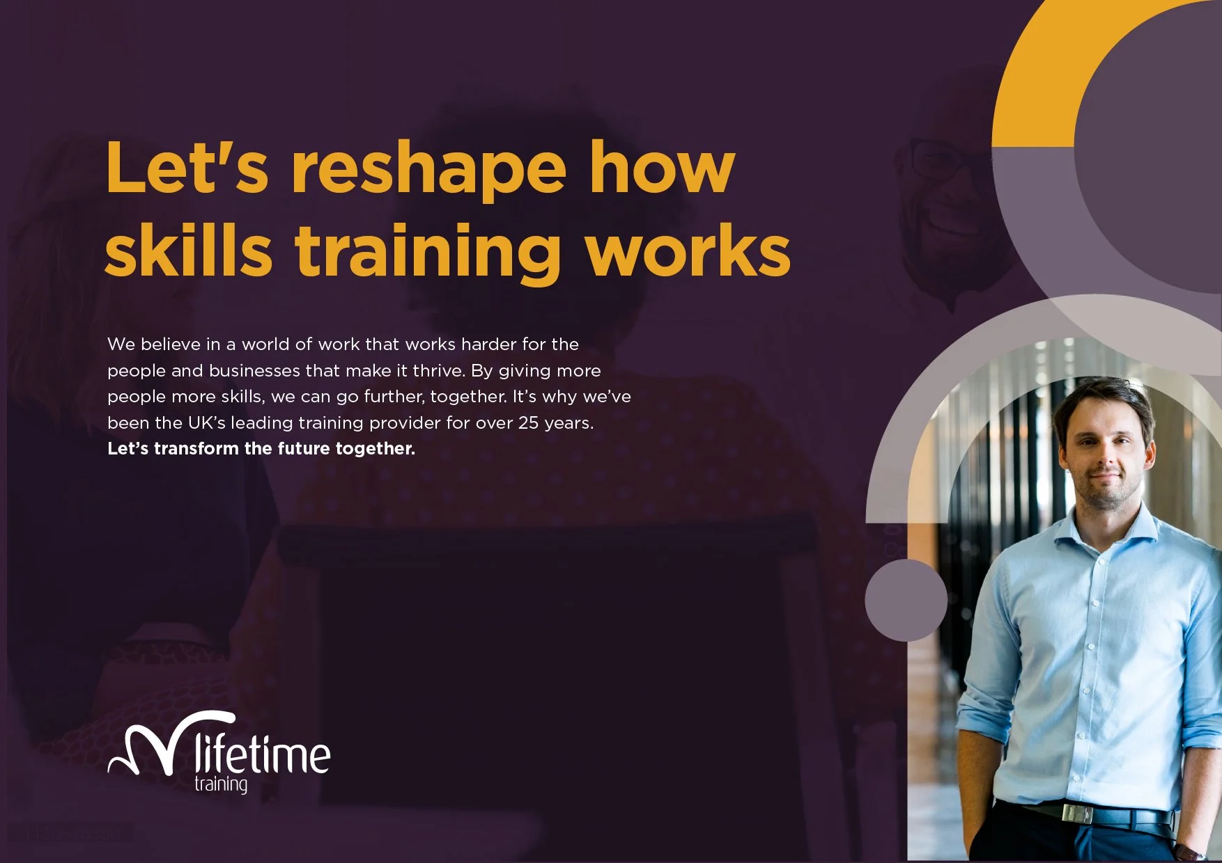
The brief: reinvigorate the brand to reflect their evolved position in the market, and create a coherent identity that aligned with a new strategic direction, grounded in the idea of a "democracy of opportunity."

Lifetime’s existing visual identity was fractured, with different departments producing inconsistent, disjointed materials. The logo felt dated, and there was little visual or verbal cohesion across applications.
The challenge was to bring the identity and brand language up to date – while retaining legacy – and to introduce a unified design language that reflected the scale, energy and purpose of the organisation.
The Approach
Working closely with copywriter Jim Pyett, we developed a core brand idea: More.
“More” encapsulates everything Lifetime stands for – more opportunity, more support, more impact. It speaks to their ambition to go further for learners and employers alike, and to open new worlds of possibility across the UK’s workforce.
From there, I refreshed the Lifetime identity from the ground up:
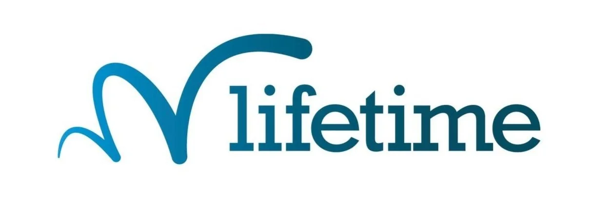
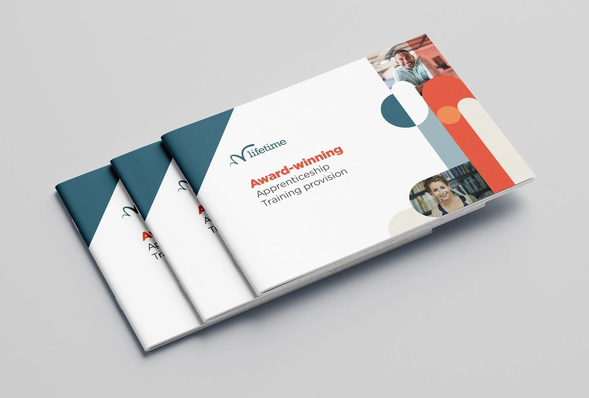
Wordmark: The logo was updated—retaining the recognisable ‘leap’ motif but simplifying the letterforms for a more contemporary, confident feel with a slab serif font.
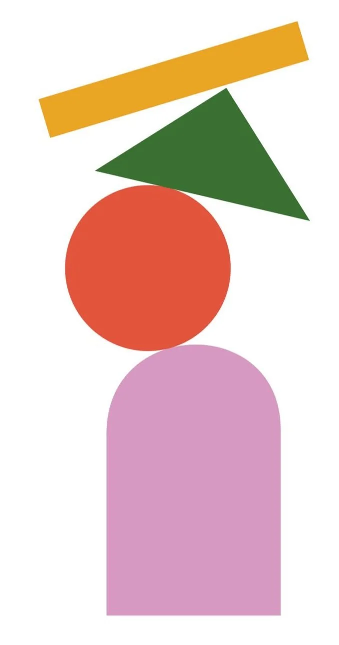
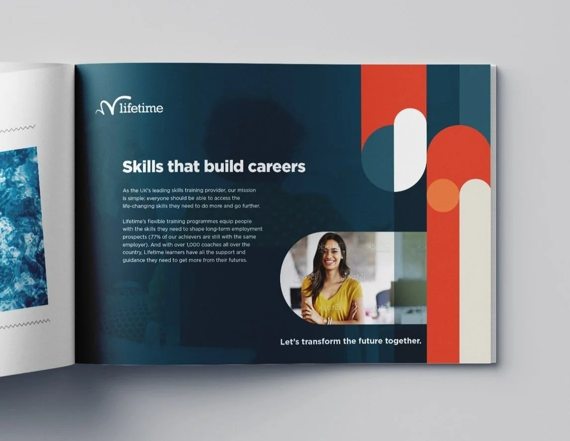
Visual System: For the concept of ‘More’ I created a suite of building blocks, colourful shapes to help create a distinctly “Lifetime” design.
Colour & Typography: A bold, modern palette was introduced, alongside a pairing of fonts to balance accessibility with presence.
Photography: Warm, human-focused imagery with diversity and professionalism across sectors at it’s core.
The refreshed identity reflects Lifetime’s position as a confident market leader.
It delivers coherence – from internal comms to B2B materials and learner-facing content, and has been designed to scale with the organisation as it works toward its ambitious goal: getting half a million people into skills training by 2030.
